New Opsgenie User Interface
As part of the integration with Atlassian, we're working to provide the best User Experience by standardizing the look and feel of the product and simplifying the navigation.
We are thrilled to announce that Opsgenie is switching to a revamped interface. The new look and feel provide a simplified navigation structure with a better grouping that is standard across Atlassian products. All functionality remains the same.
New Opsgenie UI will be available starting from April 9, 2019. Account owners and admins can switch their account to the new UI via switch button on Settings page >> General tab. Please note that, once you enable the new UI, there will not be an option to switch back to the old UI and all of the users in your account will start using the new UI.
Be careful!If you do not switch manually, the new UI will be enforced automatically after April 30, 2019.
In the following guide, we've put together a few examples of the changes we're introducing.
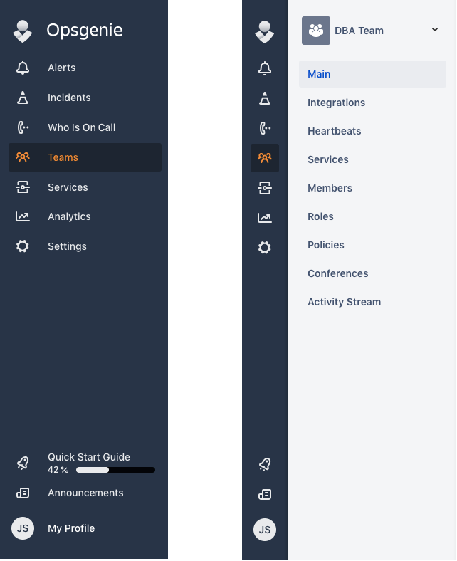
Two-layered sidebar
One of the major changes comes with the main navigation bar. We're introducing a two-layered sidebar, which offers a better navigation experience.
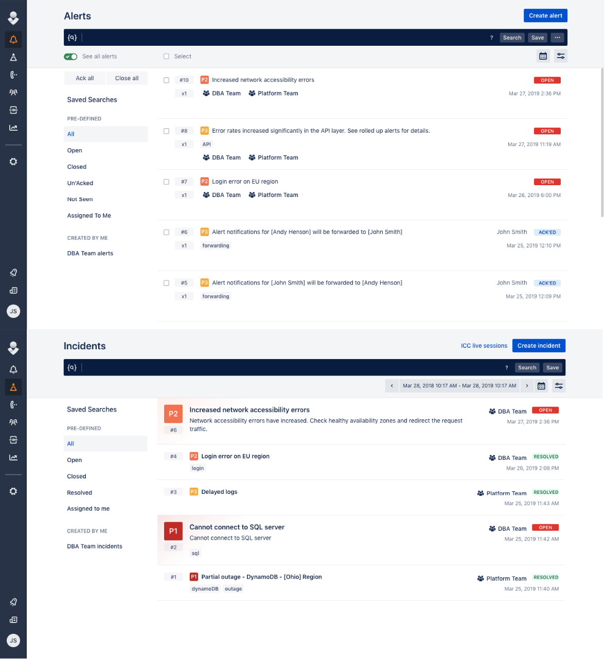
Alerts and incidents pages
Within the new UI, we separated Alerts & Incidents page. Previously, alerts and incidents offered on the same page-tab switch. New design Alerts and incidents can be reached from the main menu separately. We also offered a brand new design for Alert and incident layout, which can be seen in detail on the following images:
Admin configurations and settings
The sub-navigation capabilities provide simplified navigation. Because of this change, we've moved the following items under the global Settings menu:
- My Profile: Includes profile/notification configurations, forwarding rules, and on-call schedules.
- Global configurations: Includes global schedules, global services, and global escalations.
- Integrations: Includes global integration configurations and heartbeats.
- People: Includes users and user roles.
- Logs
- App settings: Includes general account settings, SSO, central notification templates, API key management, email templates, and edge encryption.
My Profile
To reach your profile configuration page (which includes profile, notification configurations, forwarding rules and my on-call schedules) you can use the Settings menu. Within the new navigation design, we also propose My profile button at the end of the main navigation menu. My profile button offers the following functionalities:
- Switch between your accounts via Switch account option. Your accounts will be listed under this option. To learn more about switch account option, please refer here (doc/blog post etc.. about switch account/new login experience)
- Quick access to Profile configuration page.
- Quick access to My on-call schedule.
- Quick access to Mute option.
Quick Start Guide
You can find it at the bottom with a progress bar and progress percentage.
Breadcrumbs
Breadcrumb navigation is available for easy access to previous pages.

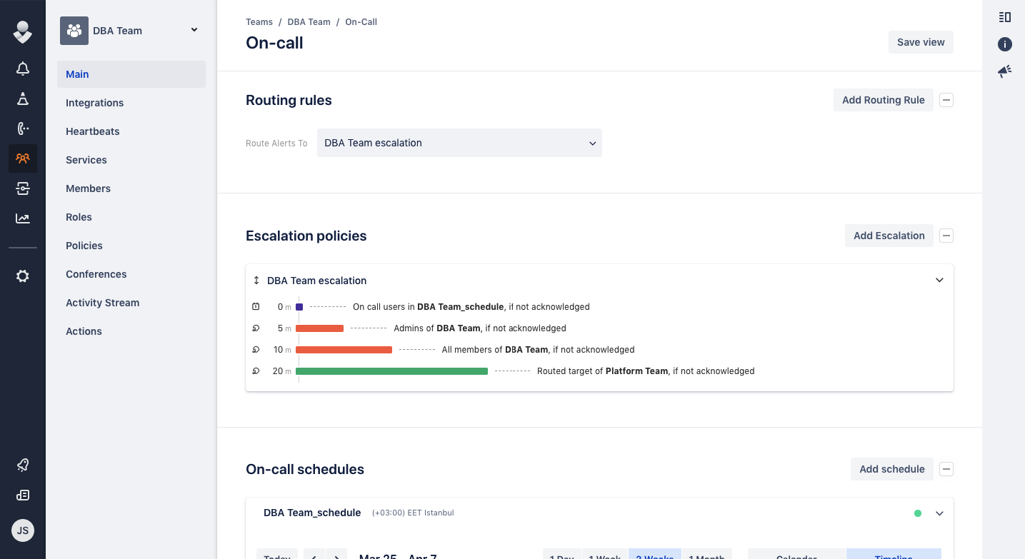
Teams
In addition to the changes explained in the previous topic, team dashboard has renewed in terms of look and feel. Also add team and save view buttons are moved to the top right. Tab view is no longer available.
Other improvements
-
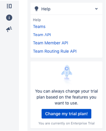
Change trial plan experience has changed.
-
Reports and Service List pages are renamed as Analytics and Services.
-
Buttons to create/add new entities are moved next to the headers, on the right-hand side. Multiple actions are grouped under ellipsis buttons.
-
Help sidebar on the right is now collapsable, includes essential documentation links and trial plan change button for trail plan customers.
Revamped Alerts section
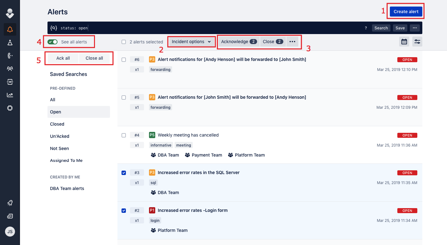
Alert list view
- Create alert button
- Incident options for the selected alerts
- Bulk actions for the selected alerts
- See all alerts button
- Bulk actions
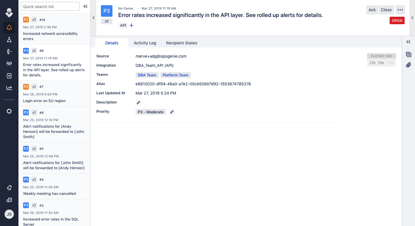
Alert details
New incidents layout
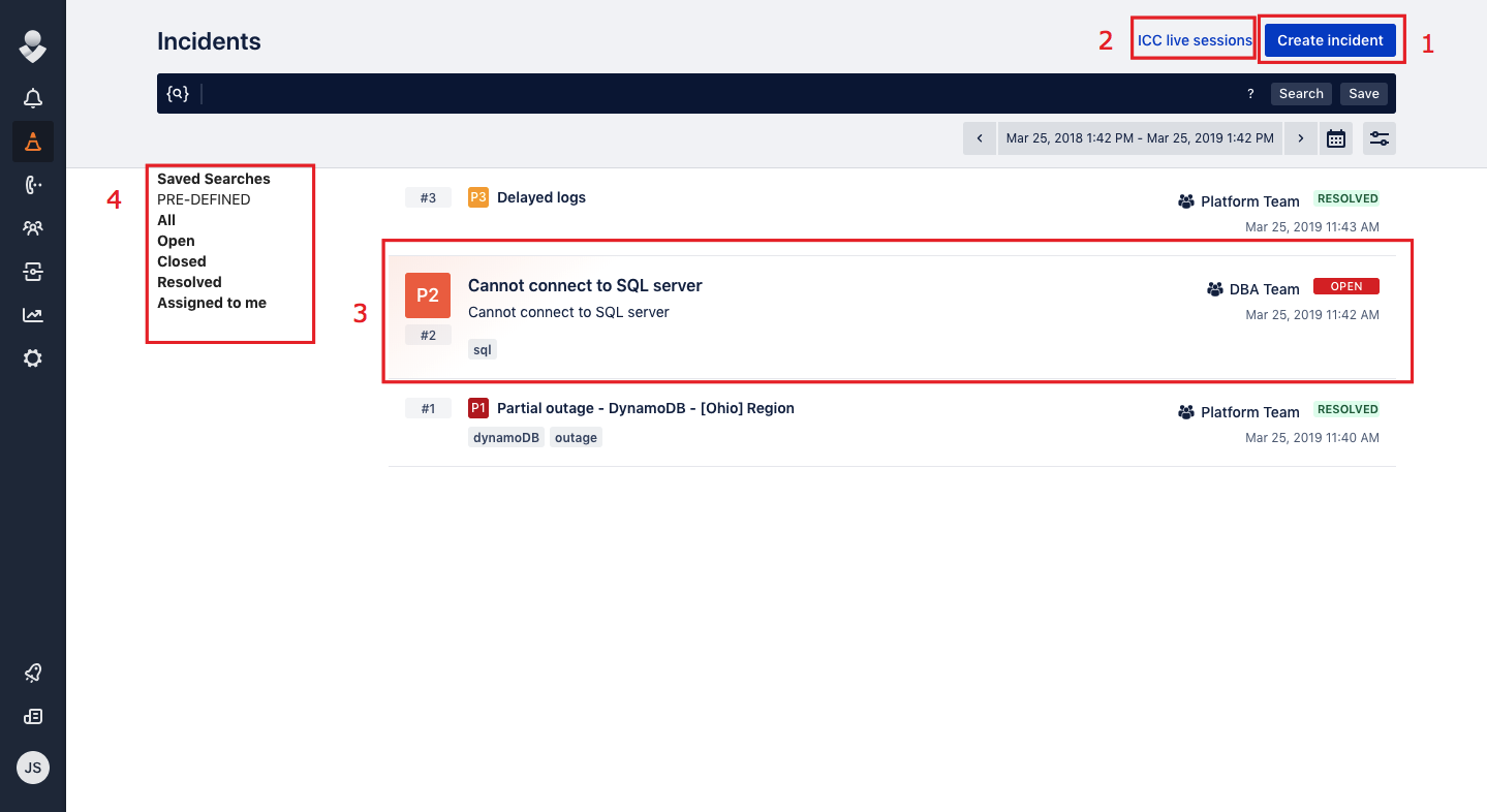
Incident list view
- Create incident button
- ICC live sessions
- Open incident view
- Saved searches
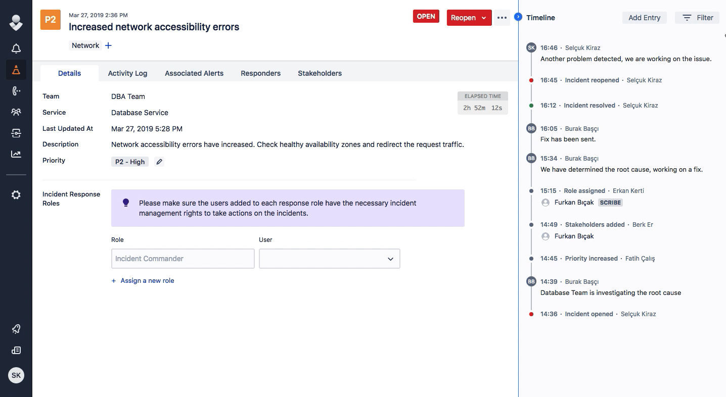
Incident details
Mobile
Opsgenie mobile application UI will remain the same for now.
Updated 11 months ago
